03 July 2010

8 is Great. Happy 4th!

Deceptively easy looking aren't they?  A lot of layers were added, morphed, calculated, altered and dumped to get here...  ten maps total in 8 and there are from step 3 -green- and step 4 -blue-...  I liked that i could use one legend for 3 compared to seperate legends for four.  The values were all the same.  But in four the actual numbers were all different and using equal interval as instructed meant all the categories had different values even though the colors are the same.  This seems deceptive since dark blue on one map may not have as much crime as dark blue on another. 
I had no real problems other than it being somewhat time consuming and always defaulting to D instead of H.  Something to always watch for.  Probably the most enjoyable lab so far.

19 June 2010

Alachua House

I'm SOooooo looking forward to doing this all over again next week...  the same 'only different'.    Time consuming only because i'm not one of those 20-somethings we see on tv that can reprogram the world with six keystrokes.  No major blunders, at least not anything i couldn't recover from.  Now to enjoy the weekend...
Oh, the parameter map above that isn't masked...  i 'told it to' mask...  did every step identical to all the others and it refused...  never did figure that out, so i ELMO'd it and moved on.

12 June 2010

week 5 Deliverable 2

Sometimes everything just all comes together.  This one was flawless.  After the last couple I/we've had, this was a very relaxing change.  Making this took only minutes.


Week 5 Deliverable 1

An easy to do and easy to understand project of understandable worth.  I could have saved plenty of time by making the 'fix' beforehand instead of waiting for the expected Error to strike though.  That ate up a lot of time, which could have been used to do 2 and 3.  I'd recommend everyone else 'fix' their Impact folder instead of hoping to be lucky and not have the error.  The fix also skips from the middle of step three to step six.  "Do You Feel Lucky?"

10 June 2010

Participation Summary for Deepwater GIS Disaster Response

Timothy Mahar


4048 GIS Apps

Amber Bloechle

10 June 2010


Summary

Role of GIS in Disasters

As seen in Deepwater Horizon Response


In times of disaster, whether local, national, or international, GIS managers could be expected to already be prepared tp offer a wide variety of maps in a plethora of formats. Along the lines of the Combat GIS, they should also be ready to offer maps of things not before thought of. And to do it faster than they believed possible.

When considering something on the magnitude of the Deepwater Horizon response, these maps would offer information far beyond the basic requirement of knowing where the oil is. Maps, preferably 3d in many instances should be available to show available staging grounds –such as Destin Florida just announced State Staging Ground which is now located in Henderson Beach State Park along it’s beachfront parking areas which are quite near local docks and the local airport.

Other layers could include all other boat/dock locations, airplane/airstrip locations, as well as helicopters and helipads. Not to be overlooked are the US Naval and Air Force assets though not all of these would be within the confines of the original spill area.

Of utmost importance would be the mapping of the locations of the various species. Not just the endangered ones, though that would be a high priority, but all the species along the coastal transition zone from surf to dunes which would be impacted. Nesting birds and turtles are important but so are the fish releasing eggs in the gulf which will be killed by the pesticide being called ‘dispersant’.

Additionally the timing of thee tides will cause some places to be spared while some areas will receive an extra dose. A tidal zone map would be needed with a chart showing the times over the next days/weeks.

Worse, oil near the surface will trend eastward on the current, while deeper oil will trend west on the lower current. To the East you have nests, to the wwest you have corals and whales.

Other layers/maps would display surface temperature, differences in which may reveal unseen oil. Another layer/map would be albedo which would certainly reveal surface oils. There are also several things we monitor in the gulf such as the chemistry of the water which would reveal the presence of unseen oil.

Ideally these would all be mapped onto a main map like out part II of the oil week assignment which could then be broken down by smaller area numbers, yet they would all remain on the same scale, and projection and be relevant and easily read by anyone who saw them as responders moved from one area to another.

The perfect output type would seem to be 3D because it could show an undated location of the oil, either visibly, or chemically, and would also demonstrate it’s proximity to the currents, to wildlife, above or below, and to the available command posts and their resources.

01 June 2010

Mississippi Katrina flooding by land type

Good to know the next time i'm at the Isle of Capri that the surge will be largely stopped by Dog Island.  Being familiar with the coast and having been out on both Ship and Dauphin islands, i can say the 15 ft foot surge there topping them is no surprise, but the relative lack of flooding from the surge in the very flat area from Biloxi to Gulfport (and beyond) comes as quite a surprise. I take that to be -much like Destin, the area is a peninsula and the water just drains right off and doesn't stick around to 'flood'. 

Mississippi/Katrina Flooding.

This was an enjoyable project which revealed the impact of flooding based on land type across coastal Mississippi.  The relative amount of flooded wetlands versus infrastructure was somewhat suprising (though it shouldn't have been).  Other than the data not 'taking' on the first download, i had no problems with this exercise and actually rather enjoyed it.  While i found a way to 'straighten' the map, i opted to leave it in the format presented. 


28 April 2010

Final Project Links

These links both tested as working.  Our instructions included homepages and subfolders...  I merely copy/pasted from my thumbdrive to H: then to I:    nowhere near as difficult as the directions made it sound.  Written Summary was crafted with the voice of someone 'doing' the actual presentation who would be pointing at the slides for his audience.

Powerpoint Link for Bobwhite-Manatee Transmission Line Project:

http://students.uwf.edu/ttm3/2010%20GIS%204043%20Bobwhite%20POWERPOINT.ppsx


Written Summary Link for Bobwhite-Manatee Transmission Line Project:

http://students.uwf.edu/ttm3/GIS%204043%20Bobwhite%20transmission%20Written%20Summary.pdf

02 April 2010

Pretty straightforward.
Just lots of button clicking.
No Problems.  The most time comsuming due to the pages of directions which could have been condensed to 1/8 of what there were.could have been spiffier had the "Elev" layer which comes loaded with the map not waited until the very last step 8 pages later to inform me that is was "corrupt".  When connecting the things in the final step the maching insisted on 'connecting a variable with a process' which it said it could not do because though all the Aspect, Hillshade and Slope parts were there waiting, trying to move the Elev layer from the ArcMap TOC as instructed resulted in a msg that the data set wasn't supported...   tried everything i could to no avail.  SInce there was nothing i had dont 'to' the layer, i had to presume there was something wrong with it.  The attribute table showed "0".  This is the result of the first 7 steps, the eighth i could not do without the Elev layer which is in step 1.  Now THIS was a fun one...  Reclass.  Masking was fun and i could have played around with that a bit more...  I ran into trouble at the tail end of step six where it says it is "optional".  It's hard to go on without it.  (I tried).  But when i gave it the SlpDeg it asked for,  It coughed them back up at me...  LUCKILY, the next thing we do is switch that to SlpPer.  For whatever reason, that one 'took' so i could continue.  Probably one of the more useful and enjoyable exercises.

Someone called this the WILD map and implied "fun" hence a fun design.  This shows a 3D layer atop a deceptively flat raster layer of the same terrain...  The exercise for this (named in the map title) was to compare a hike across seemingly flat terrain and to compare that to what you would really encounter while out doing it.  Didn't know if i 'could' make a map in ArcScene from this so i moved it into ArcMap (it didn't want to go) and put in the symbols that i could there.  No idea how to honestly scale it so I left that off... the legend stayed in ArcScene... Don't Ask.  It just did. 

25 March 2010

Spring Break ExCr ASSIGNED

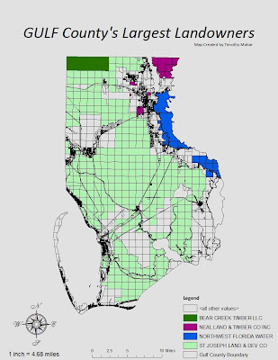
Easy lab which would have taken mere moments had the computer not chosen to perform random functions when i wasn't looking...   fortunately i constantly resave because twice i had to shut down and come back into my saved map to continue.   I would have preferred to rid the map of the gridded look but couldn't fand a way since the grid is part of the layer which shows the physical border as well.  Placing the aceraga totals directly ON the map would have made sense but looked quite sloppy with the grid there as well, so i decided to skip them, trusting that the audience for this map would be able to tell easily enough that St Joe owns most of the county without needing a numner to confude the issue.

17 March 2010

Potential Campsites week 9

Q1.  I tried "intersect"  but it left out large portions of the map area...  predictably, so i then tried "Update" which gave me something much closer to what the directions to use "Union" had us all end up with.
Q2.  I used the "Erase" tool because the purposes of none of the other made any sense for 'eliminating' the area in question.  Erasae was the only option that made sense.
Q3.  There were 79 features in this layer and (since we were instructed to find an area but not given a scale to use, i chose sq. miles) The largest area was 0.4127 square miles.  The smallest area was 0.00012 square miles.

25 February 2010

Week 7 Data Editing UWF Campus

The actual itself is easy.  It's the remembering the things we learned weeks ago and then filed away with the cobwebs in the mind that can be infuriating.  An enjoyable lab overall.

18 February 2010

Week6 Georeferencing Rasters

Fun.  Kind of like giftwrapping a basketball for christmas...   the buildings were easy and made me over confident.  Then when i tried aligning the road exactly as it should have been, a weird thing happened.  The error numbers went down but the warping went up.  Eventually i gave up on aligning the roads and i now understand why the Okaloosa County GIS can't get the roads right in my neighborhood either.  So i don't feel so bad!
All set to post this to the blog and then i noticed Lynn's post...   i'd only done S having thought of N as 'practice'...  Had to go back and stitch them together...  I'm not saying it's pretty...  but it is done.

03 February 2010

This is a shot of the hurricane's epicenter i found online showing how the earthquake was not just off in the distance but right under the capitol area...   It is lacking a bit for details but it gets the main mission accomplished in that it overlays the shaking of the quake with the coastal area where most Haitians live...  The purpose is to emphasize how hard the Haitians were indeed hit regarding their population and infrastructure.  I found it on the ESRI site under News...

Week 4 Reprojection Map


This took me awhile but I believe I have crafted that which was desired.  At least it does relay the information in a manner which is clear and understandable.  I would have liked the counties to have been a solid of a different color or shade but, uncertain how to accomplish that goal i settled for outlining them -which i couldn't remember how to do.  Even with notes.  I'm pleased with the result though.  We learn as we go.

26 January 2010

Week 3 Maps (all)

This would have been far quicker if i could eliminate occasional user error.  Accidentally placed something on the map that was unwanted and it took way too long to discover the 'clear selected features' feature...  I was afraid it would erase 'everything'.  Adding labels was also far easier than i was trying to make it. 
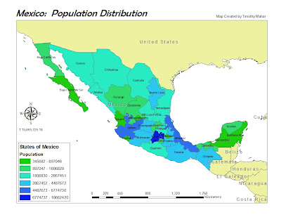
Tha adventure continues with map 2.  Pretty straightforward as long as you follow directions.  When in doubt either the directions are wrong (kidding!) or else it only takes one click to fix.  (just need to know what to click!)
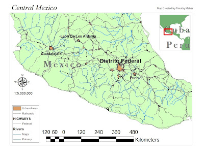
An easy map to make and enjoyable to be a little creative.  I enjoy hiking in the high country and was suprised Mexico had so much relatively high terrain.  This was the least complicated of the three maps to create. 

19 January 2010

World Population Map


Easy lab.  User error caused the scale bar to disappear and not return.  Eventually random attempts at restoring it caused the option of inserting a new one to become available again. 

14 January 2010